Windows 11 was the most significant design overhaul to Windows in years, and one seemingly-minor change is still divisive: the new right-click menu in the File Explorer. Here's why it's actually a good change.
When you right-click a file in the File Explorer on Windows, you get a menu with actions for that file, such as copying it to the clipboard or creating a shortcut. That's an established user interface element that dates back several decades, but it has become more difficult to manage over the years, so it was one of many elements of Windows that Microsoft decided to redesign for the modern era.
A Mess of a Menu
The right-click menu, also called the context menu, has been available when selecting files and folders in Windows for decades. Starting with Windows 2000 and Windows, Microsoft introduced IContextMenu, which allowed applications to add their own items to the context menu. For example, if you installed 7-Zip, you might be able to select multiple files and then compress them into a ZIP file straight from the context menu.
The ability to complete actions with files straight from the context menu, sometimes without anything else opening, is a fantastic feature. However, it has the same problem as many other features in Windows -- a lack of organization and easy controls. As you install more applications, the menu becomes longer and longer with items and actions you might not even use. Many of the menu items don't even have icons, which means more time reading to find the item you want.

Microsoft outlined more problems in a blog post from 2021, namely that "commands that should be grouped together -- such as Open and Open with -- are sometimes far apart," and that the menu "has grown in an unregulated environment for 20 years, since Windows XP." It also makes no sense that Copy, Cut, Delete, Rename, and Properties are at the bottom of the menu and require the most mouse movement, since they are the most-used actions. There's also inconsistent grouping and action names, even in the default menu with no third-party apps polluting the layout.
Finally, the old menu could cause performance issues with File Explorer, especially if one of the third-party menu actions had buggy code. Microsoft explained in the same blog post that "many commands run in-process in Explorer, which can cause performance and reliability issues." It's not hard to find examples of this behavior, and we have a guide for fixing it on Windows 10 and earlier versions.
In a way, the context menu became a symbol of the overall Windows experience -- largely unchanged for 20 years, confusing for new Windows users, and easily corrupted by installing more software. The overhaul we eventually received in Windows 11 was long overdue.
A Fresh Start
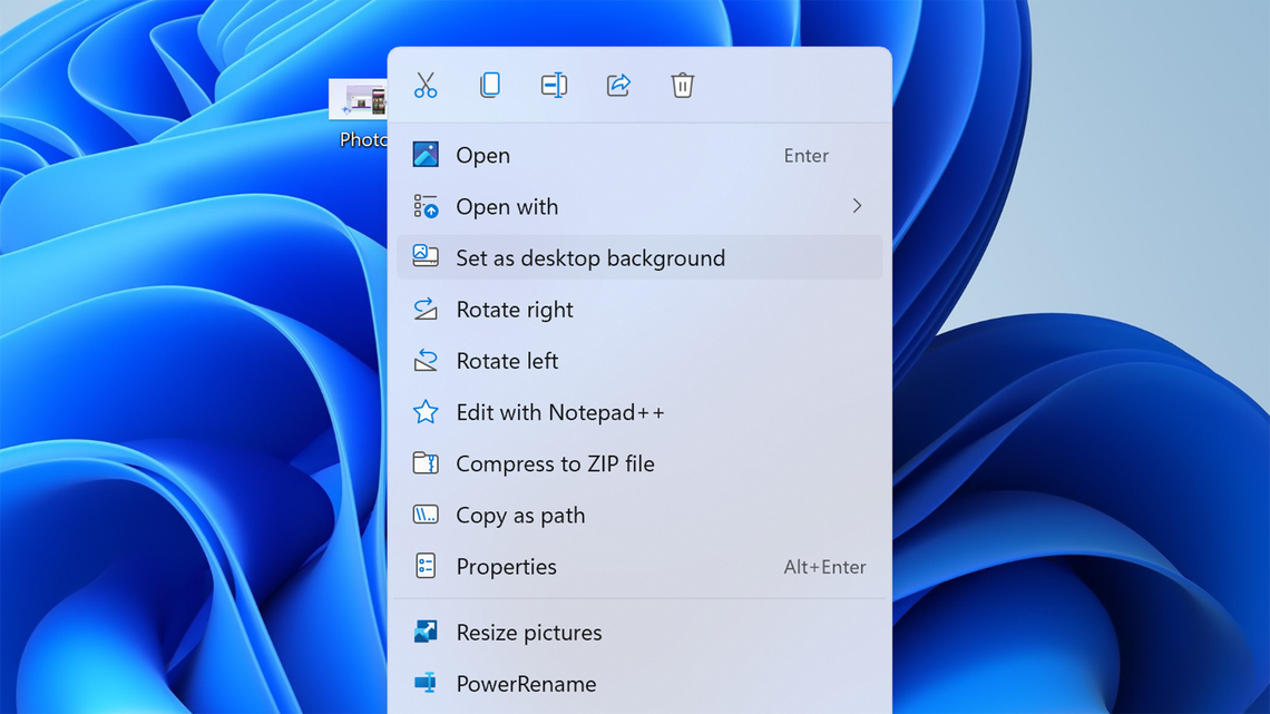
Microsoft overhauled the File Explorer's context menu in the initial release of Windows 11. It now has the same frosted glass background and rounded corners as other modern Windows elements, with larger text and icons for every menu entry. Custom menu options from installed applications are now grouped together on the bottom.
Windows 11 also moved the most common actions -- Cut, Copy, Rename, Share, and Delete -- to a single row on the top. This removes the dedicated rows for each item, which leaves more room for actions supplied by cloud services or third-party apps, and reduces mouse movement for the most popular actions. The days of scrolling to the bottom of a long menu just to copy a file are over.

The new menu wasn't popular with everyone when Windows 11 arrived, though, mostly because it didn't show custom menus created for the old menu. You have to click "Show more options," which then opens the original context menu with all the old integrations. Microsoft allows apps to add entries to the new menu, and we have seen some apps update to the new behavior -- Notepad++ added support for the new menu in March 2023, and PowerToys also adds some options.
There's still one problem with the new menu, though: there's no easy way to customize which apps appear in the menu. Ideally, there should be a panel in the Settings app for hiding entries from a given app -- just because you install an application doesn't mean you need to see it every time you copy or rename a file. Hopefully, Microsoft will add that in future Windows 11 updates.
If you immediately reverted to the old context menu after upgrading to Windows 11, I recommend giving it another try. Just like the rest of Windows 11, it's still not perfect, but it's a step forward.