Quick Links
Key Takeaways
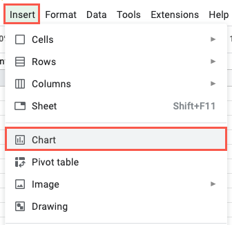
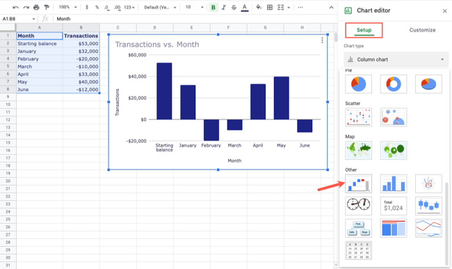
In Google Sheets, after adding your data to your spreadsheet, select your data by dragging your cursor through it. Select Insert > Chart from the menu. In the Chart Editor sidebar under the Setup tab, select the "Chart Type" drop-down box. Then, select the waterfall chart under "Other."
If you want to show how positive or negative values affect a starting value, you can create a waterfall chart in Google Sheets. You can then view the data sequentially or stacked for the most effective visual. We'll show you how in this guide.
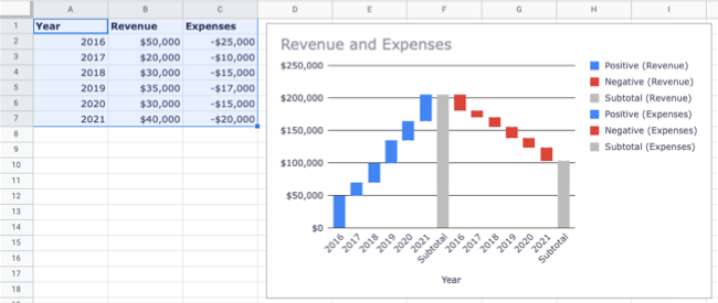
Here, we'll look at two examples of a waterfall chart in Google Sheets. You'll see one using just two columns of data sequentially and the other using three columns with the data stacked.
What Is a Waterfall Chart?
Waterfall charts show how adding or subtracting values affect a starting point over time. For example, you might chart a checking or savings account with money coming in or going out. Or, you might track inventory for a product with shipments added and sales subtracted.
By displaying these values on a waterfall chart, you get a clear picture of how the positive and negative values look over time.
Set Up the Data
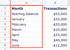
First, you must set up your data correctly. You should use the first data column to list the headings for each row. The headings will display on the horizontal axis of the chart.
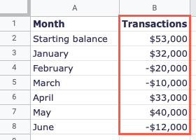
In the subsequent columns, enter the numeric data corresponding to each row. Each row is a bar on the waterfall chart.
Create a Basic Waterfall Chart
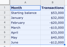
To create a basic waterfall chart using two columns of data, begin by selecting your data. You can do this by dragging your cursor through it.
Select Insert > Chart from the menu or click the Insert Chart button in the toolbar.
Google Sheets inserts a default chart type which is usually a column or bar chart. To change this to a waterfall chart, go to the Setup tab in the Chart Editor sidebar.
Then, select the "Chart Type" drop-down box and choose the waterfall chart near the bottom beneath Other.
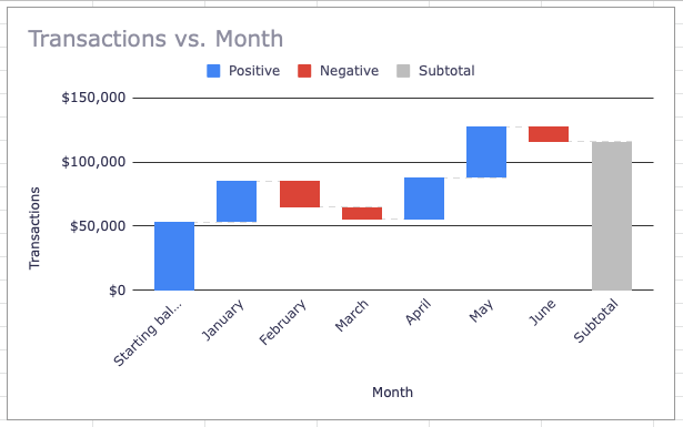
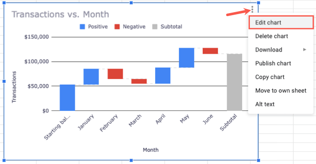
You'll then see your waterfall chart with default colors of blue for positive values and red for negative ones. You'll also notice a Subtotal bar on the far right in gray.
Create a Stacked Waterfall Chart
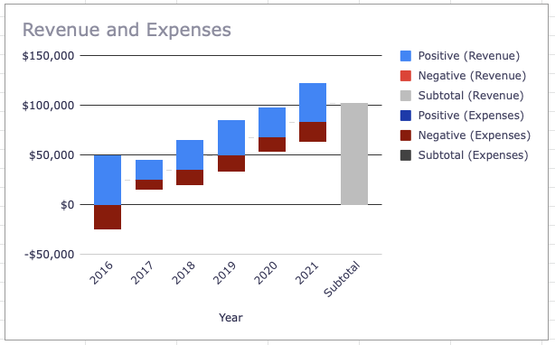
If you want to use more than the two required columns, you can use a stacked waterfall chart. This displays the data from the columns stacked on the same bars rather than separately in sequential order.
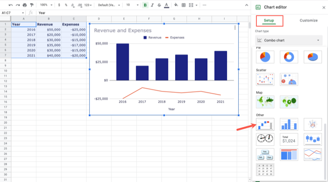
For a simple example, we'll display both income and expenses using a stacked waterfall chart. Follow the same steps as above to select your data, insert the chart, and choose the waterfall chart type.
When you see the waterfall chart, you'll notice that the data is sequential, which can make the chart difficult to interpret.
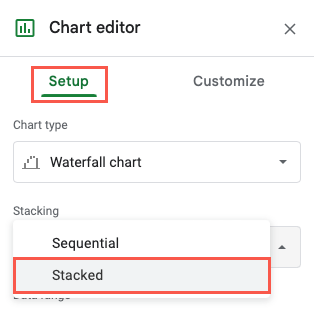
Head to the Chart Editor sidebar and choose the Setup tab. In the drop-down box below Stacking, choose "Stacked."
The chart will then update to display the column data on the same bars with different colors.
Customize a Waterfall Chart
With both the sequential and stacked waterfall charts, you can customize the appearance, labels, legend, and other items.
If you've closed the Chart Editor sidebar, reopen it by double-clicking the chart or using the three-dot menu on the top right to pick "Edit Chart."
Go to the Customize tab and expand the section you need to update the chart.
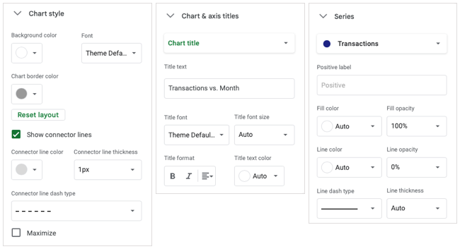
- Chart Style: Adjust the background color, font, border color, and connector line.
- Chart & Axis Titles: Change the chart title and its font style, color, size, and format.
- Series: Update the fill color and opacity, line color and opacity, and the line type and thickness for both the positive and negative labels.
- Legend: Change the legend's position, font style, size, format, and color.
- Horizontal Axis: Adjust the font for the label, reverse the axis order, and slant the labels.
- Vertical Axis: Adjust the font for the label, the scale factor, and the number format.
- Gridlines and Ticks: Choose to display minor gridlines and major and minor ticks. You can also change the spacing.
Waterfall charts are helpful visuals for showing values that change over time. For more, check out how to make a pie chart or how to create a line graph in Google Sheets.

