Quick Links
Key Takeaways
To create a Timeline chart in Google Sheets, select your data by dragging your cursor through it. Next, select Insert > Chart in the menu or click the Insert Chart button in the toolbar. In the sidebar that displays, select the Timeline chart from the drop-down box.
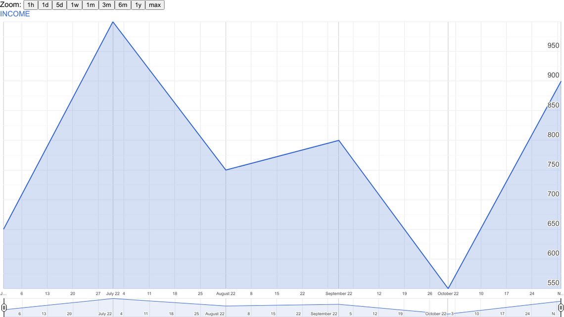
When you want to display an easy-to-read visual for items in chronological order, consider a Timeline chart. In Google Sheets, you simply enter the dates and numeric data, and you'll have a line graph with zoom options.
You can use a Timeline chart in Google Sheets to show revenue, expenses, sales, attendance, inventory, or other numeric data as it changes over time. The chart has built-in zoom features that let you focus on specific days, weeks, or months as you view the chart.
Set Up Your Data
You'll need at least two columns of data for a Timeline chart in Google Sheets. Add dates or dates with times in the first column and the numeric data in the second column.

If you have additional data, you can enter it in the third and fourth columns. These then display as secondary lines on the chart.
Each row is a point on the chart.
Create the Timeline Chart
To create the chart, select the data by dragging your cursor through it. If you have column headers that you want to include, be sure to select those as well.
Select Insert > Chart in the menu or click the Insert Chart button in the toolbar.
You'll see a default chart display, likely a column or bar chart. To change this to a Timeline chart, go to the sidebar that displays when you insert the chart.
On the Setup tab, use the Chart Type drop-down box to choose the Timeline chart at the bottom of the sidebar.
Next, if you want to include the headers, check the box for "Use Row 1 as Headers." This is especially helpful if you plan to include more than the two required columns because it shows the column header color-coded to match the line on the chart.
When you finish the initial setup for the chart, you have a few customization options.
Customize the Timeline Chart
Go to the Customize tab in the Chart Editor sidebar. If you've closed the sidebar, double-click the chart or select the three-dot menu on the top right of it. Next, pick "Edit Chart" to reopen it.
Expand the Timeline section on the Customize tab. You can then adjust the following options:
- Fill Opacity: Choose a percentage to fill the portion below the line on the chart.
- Line Thickness: Select a thickness in pixels for the line.
- Values Suffix: Add a suffix to display on the chart. This is handy if you want to expand the data on the chart but not on your sheet.
- Date Format: Choose a different date format if you like.
- Min and Max: Enter a specific minimum and maximum value instead of displaying your numeric data values on the vertical axis.
At the bottom, you'll also see three additional options you can select by checking the boxes. You can expand the range to show zero, display the zoom buttons, and show the date range selector.
View the Timeline Chart
After you create and customize your chart, take advantage of the tools you included above to view the chart.
Zoom buttons appear at the top of the chart for selecting an hour, day, week, month, or year. Select a button to zoom in on that timeframe.
The Date Range Selector displays at the bottom of the chart. Use the buttons on the left and right to slide the date range to focus on the section you want to view.
You can hover your cursor or select a point on the chart to see its particular data. You'll see the data displayed in the top right corner of the chart.
When you want to show data in chronological order, the Timeline chart in Google Sheets is ideal. For more, check out how to create a geographical map chart and how to make a pie chart in Google Sheets.