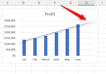
Adding a trendline to your chart helps your audience better understand the data by way of visualization. Not only can you add a trendline to your already-existing chart in Excel, but you can also format it, too.
Add a Trendline to Your Chart
To get started, open Excel and select the chart you would like to add a trendline to. If you don't already have a chart, you can create one by highlighting the cells containing the data and then selecting a chart type from the "Charts" group of the "Insert" tab. Be sure to choose the right kind of chart for your data.
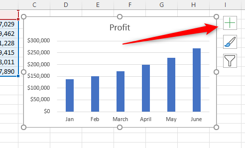
Select the chart by clicking it, and then click the "Plus" icon that appears to the right of the chart.
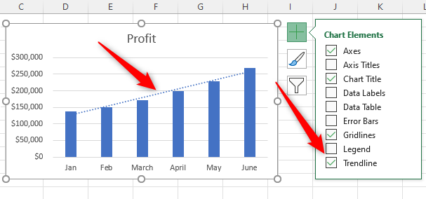
In the "Chart Elements" menu that appears, check the box next to "Trendline." Once checked, the trendline will appear on your chart.
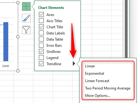
The "Linear" trendline is added by default. If you need a different type of trendline, hover your cursor over "Trendline," click the right arrow that appears, and then select a trendline style from the sub-menu. If you don't see the style you want in the sub-menu, select "More Options" to see the additional styles.
Once you've added the trendline to your chart, you can format it to stay in line with the overall design of the spreadsheet.
Format Your Trendline
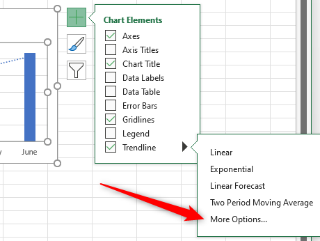
To format your trendline, select the chart, click the "Plus" icon, hover your cursor over "Trendline" and click the right arrow, and then click "More Options."
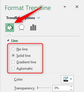
The "Format Trendline" pane will appear to the right of the Excel window. The first tab in the Format Trendline pane is the "Fill & Line" tab (paint bucket icon). This is where you can format the line of your trendline, such as making it a solid or gradient line, and changing the color, transparency, width, and other components of the line.
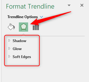
The second tab, the "Effects" tab (pentagon icon), is where you can add special effects to your line, such as adding a shadow, glow, or soft edges.
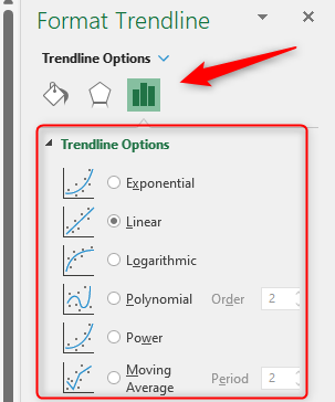
The final tab is the "Trendline Options" tab (bar graph icon). This is where you can choose the type of trendline you want, including the additional styles not found in the previous sub-menu.
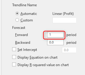
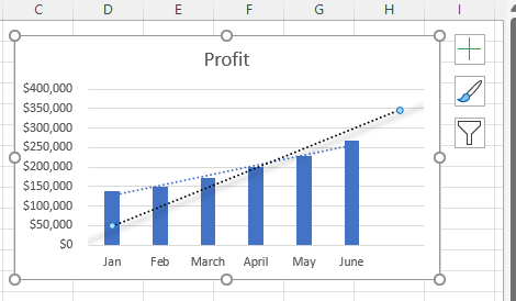
You can also set a "Forecast" here, which determines how long the trendline will go past the current data. For example, if you set the "Forward" forecast option to "1":
Then the trendline will go one period past the last data point in the chart.
You can also choose to set the intercept:
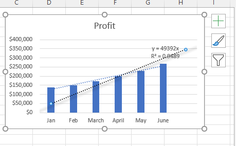
And display the trendline's "Equation" and "R-squared value" on the chart:
Play around with the different formatting options to perfect your trendline. Once it's ready, you can copy and paste your chart elsewhere to show it off!
Adding a trendline provides a powerful visual for a data trend. This is just one of the many things you can do the help your Excel chart really stand out.

