Quick Links
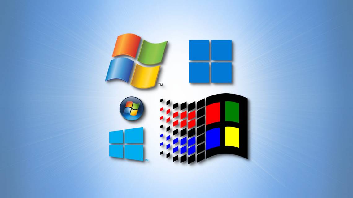
Over the past 37 years, Microsoft has used a variety of logo designs to represent its flagship product, Microsoft Windows. We'll take a look at each major version as the design has evolved through the ages.
Before we begin our trip through the past, it's important to note that while researching, we discovered dozens of minor variations on the Windows logo used in print, advertising, software, retail box art, and more---far too many to cover in detail here. We're going to group together some of the major shapes and themes Microsoft has used for Windows logo branding over time.
The Tiled Window: 1985-1989

At first, Windows didn't have much of a logo. The box art, splash screens, and advertisements for Windows 1.0 (1985) and 2.0 (1987) usually used a "Microsoft Windows" wordmark in a special font with no special icon beside it. But in recent years, Microsoft has uncovered a seldom-used Windows 1.x and 2.x-era logo with a non-symmetrical four-panel design (seen at top, above) evocative of various sizes of tiled windows in Windows 1.0, which filled the screen but didn't overlap.
In a blog post from 2012, Sam Moreau of Microsoft cited this design as "the original Windows logo," but in practice, it was rarely used at the time. After searching, we've only found it used in conjunction with a Microsoft Windows Development Seminar event hosted in 1986 and 1987---and a rare boxed copy of Windows distributed at the event. But it still set the stage for things to come.
The Stark Window: 1990-1991

Like Windows 1.x and 2.x, Windows 3.0 (1990) mostly used a word-based logo---as seen above on the Windows 3.0 splash screen to the right. "With Windows 3.0, there wasn't a standard Windows logo," says Brad Silverberg, the Microsoft VP in charge of Windows at the time. "Each marketing group, sales group, or sales event did their own. Sometimes one was reused, but there was no standard."
Some Windows application retail boxes also used an early illustration of a window with heavy gradients on some products to denote compatibility with Windows 3.0 (seen above on the left.) This is the first appearance of what is clearly a metaphor for a house window, with four panes set in a thick border. It's a design motif that has stuck with Windows in various forms to this day.
The Windows Flag: 1990-1993

Windows 3.1 freshened things up for Microsoft in 1992 by introducing a vibrant new logo that borrowed the windowpane motif but turned it into a waving flag with a trail behind it. Four colors (red, green, blue, and yellow) fill the panes of this flag-window, while the waving trail breaks into discrete blocks, possibly suggesting discrete digital units of information.
Former Microsoft VP Brad Silverberg related the origins of the famous flag logo to How-To Geek: "I felt [the lack of a standard Windows logo in the 3.0 era] was a huge missed opportunity, and that we needed to create a new logo and mandate it be used everywhere. I directed the systems marketing group to develop a new one. They used some outside designers, presented the finalists to me, and I chose the now-iconic Windows flag. It's still my favorite. It established the colors, the overall design, has motion/dynamism, and it lasted decades. I wanted to build some equity in the logo and it worked!"
Microsoft also used this flag logo with Windows NT 3.1 (the first-ever release of NT) the following year.
The Flying Flag: 1994-2000

In 1994, Microsoft designers put a new spin on the waving flag logo of the Windows 3.1 era by tilting it clockwise at a slight angle, suggesting movement and action. This new logo first appeared with Windows NT 3.5 in 1994, but soon made its way to Windows 95, Windows NT 4.0 (1996), Windows CE (1996), Windows 98, Windows Me (2000), and Windows 2000 in various forms.
In particular, with the logos for Me and 2000, Microsoft added some extra square window elements around the flying flag for a fresher look.
The Simple Flag: 2001-2011

With Windows XP in 2001, Microsoft stripped down the flying flag idea into four simple colored panels waving in the wind. Similar colors remained in the panels, but the black border disappeared. With Windows Vista (2006), Microsoft gave the simple flag a new bloom gradient in the center and often placed it in a shaded bubble.
Windows 7 (2009) continued the Vista tradition with variations, and Windows Phone 7 (2010) used a pure white version of the simple flag set in bubbles or squares shapes.
The Angled Window: 2012-2020

With Windows 8 (2012), Microsoft went back to the drawing board with the Windows logo, abandoning the waving flag-like design used in the past and making the four panes look more like a house window again, but set at an angle. The new logo's stark design also purposefully reflected Windows 8's "Metro" interface, which included app panels (tiles) instead of icons.
The new angled window logo also appeared in Windows RT (2012), Windows Phone 8 (2012), some versions of Windows Embedded Compact, Windows 8.1 (2013), and Windows 10 (2015). However, there are some variations in the precise angles and pane sizes between different versions.
The Grid Window: 2021-Present

We now come to the present day with Windows 11, which Microsoft released in 2021. For the Windows 11 logo, Microsoft got rid of the angle and decided on a simple grid of four squares rendered in blue. In fact, it was inspired by the Microsoft logo (first introduced in 2012), which is currently the same shape but in the four traditional Windows colors (red, green, blue, yellow).
In a Microsoft promotional video, Windows brand manager Vincent Joris said, "We looked at the Microsoft logo and turned it blue, which is the color that people associate the most with Windows."
The new logo reflects the clean new design of Windows 11 while retaining the famous four-pane house window motif used for at least 22 years. We're guessing that, as long as there's a Windows operating system, there will probably be a window somewhere in the logo.