There are plenty of fonts to choose from these days. You've got the fonts pre-loaded on your device, plus a huge selection available online. Which font should you use? Let's start with the fonts you shouldn't use.
A quick note before we dive in: Technically speaking, what most people refer to as a "font" is actually called a "typeface." The term "typeface" refers to the shape of the letters, whereas "font" is technically the file that contains those shapes. However, most people use these terms interchangeably, so we'll be sticking with "font."
Comic Sans
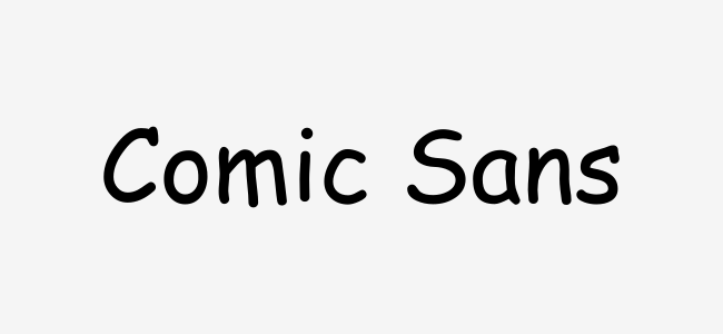
You might not be surprised to see Comic Sans on this list. To a certain subset of people, it's the worst font ever created, and they would never dream of using it. However, many people love Comic Sans. I still see Comic Sans being used plenty.
The problem with Comic Sans is twofold. For starters, it's used way too much, which creates the second problem: People don't use it correctly. Comic Sans is a casual, playful font, but sometimes it gets used in more formal contexts. It can send mixed messages.
Comic Sans Alternatives
Times New Roman
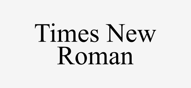
This might be a bit controversial, but I think Times New Roman has been played out. Don't get me wrong, it's a perfectly nice font, but there's also nothing special about it. There are better serif fonts out there.
Times New Roman is a very old font. People have been using it for "formal" documents for ages. It's become a very generic, bland, overused font. There's no character or personality to it. Using Times New Roman sends a message that says "I don't care how this looks."
Times New Roman Alternatives
Papyrus
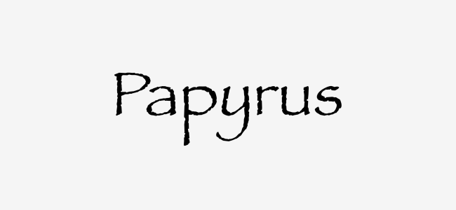
If I'm being honest, I think Papyrus might be uglier than Comic Sans. It's hard to explain why Papyrus is ugly, but there are a lot of people who seem to agree. It was even the subject of an SNL skit with Ryan Gosling.
I'm not sure what emotion Papyrus is trying to evoke. It's not quite casual, but certainly not formal. It's a bit childish, but not really playful. There's something kitschy about it too. Papyrus just looks cheap. You can do better.
Papyrus Alternatives
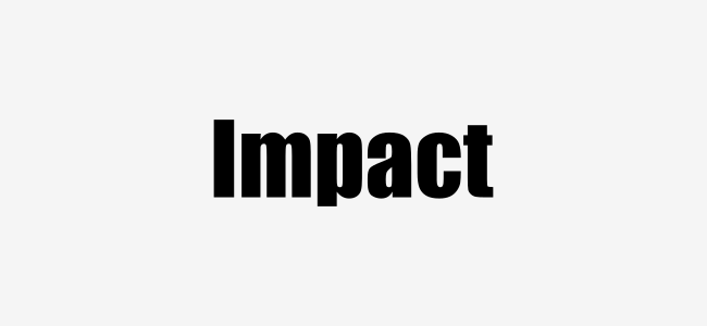
Impact
If you've seen a meme online, you've seen the Impact font. That is precisely why you should stop using this font that has been included in Microsoft Windows for many years.
Impact is a nice font for when you want something bold and strong. But, like Times New Roman, it's been available to everyone for a long time. Using Impact signifies that you spent a few seconds scrolling through Microsoft Word's font dropdown menu.
Impact Alternatives
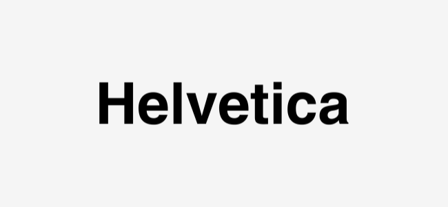
Helvetica
Look, Helvetica is a very nice font. In fact, it's a great font. It's probably one of the most universally liked fonts out there. However, that is not a good reason to use a font.
It seems like a lot of people use Helvetica simply because it's Helvetica. "Everyone likes this font, so I'm going to use it." But does it actually fit with what you're using it for? Helvetica is not a one-size-fits-all font. There are plenty of other great clean, minimal fonts to have in your rotation.
Helvetica Alternatives
Some fonts are just plain ugly, others are so over-used they've lost all character. The thing to know is you have a lot of choices. There's no reason to stick with the default fonts on your PC or the fonts you know everyone else knows about. Find your own personal favorites.

