Even though Microsoft Excel offers a good selection of chart types, you may have a situation where you need something outside the norm. A chart that overlaps may be what you need. Here's how to make one.
We'll explain two methods for overlaying charts in Excel. The one you choose depends on the amount of data you have to show and how you want it to display.
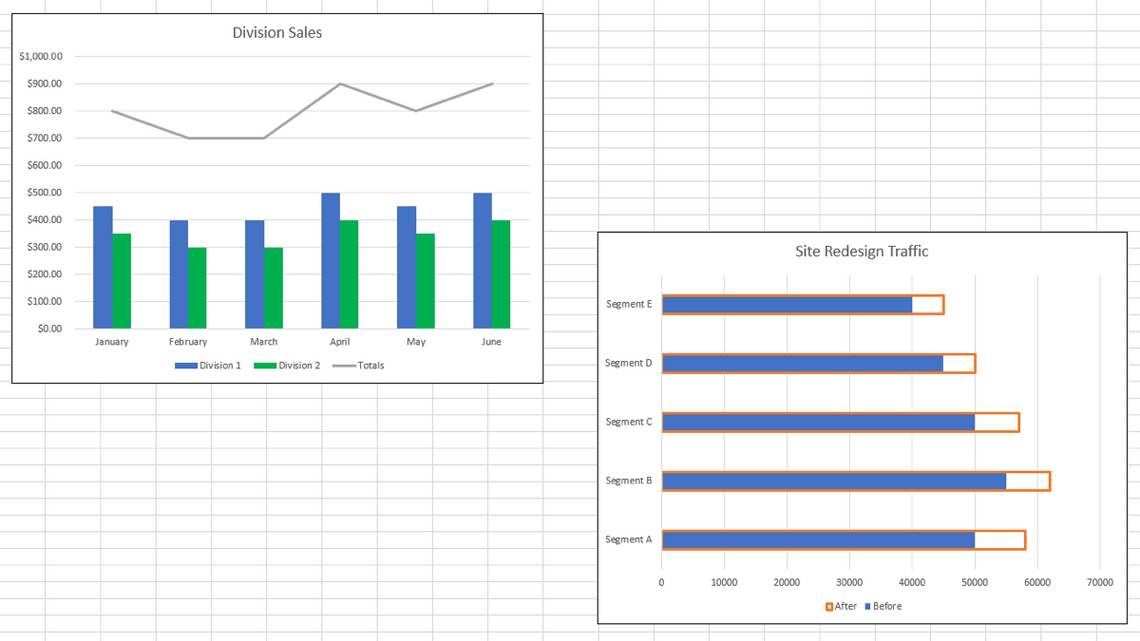
Create a Combo Chart in Excel
If you want to overlap two different types of graphs, a custom combo chart is an ideal solution. You can combine column, bar, line, area, and a few other chart types into one great visual.
Below we have a column chart showing sales for our two divisions along with the totals. As you can see, the Totals series looks out of place and doesn't depict the data clearly.

If we use a custom combo chart, we can change the Total series to a line on our column chart.
Change your chart: If you already have a chart you want to change, select it and go to the Chart Design tab. Click "Change Chart Type" on the right side of the ribbon.

In the Change Chart Type window, select Combo on the left and Custom Combination on the right.

Create your chart: If you don't have a chart set up yet, select your data and go to the Insert tab. In the Charts section of the ribbon, click the drop-down arrow for Insert Combo Chart and select "Create Custom Combo Chart."

Set Up the Combo Chart
With the Chart window open and the Custom Combination Chart selected, you'll see the area you can work with at the bottom.
Next to each data series, select the type of chart you want to use in the drop-down box. Optionally, you can add a Secondary Axis for any of the series by checking the box to the right.

As you make your selections, you'll see a preview at the top so you can see if it's what you want. When you're happy with your selections, click "OK."

Now we have a combo chart that displays our divisions as columns and our totals as a line. This gives us a much better picture of the data we're trying to convey.

Overlap the Series in Excel
Maybe it's not different types of graphs you want to overlap but certain data in a chart. You can overlay a chart in Excel by customizing a series.
For a basic example, we have a bar chart with two data series. The graph shows the amount of traffic to our site before and after our website redesign. There's nothing wrong with the way the data displays, but we prefer to give it some oomph for better impact.

Select the series with the longer bars, here that would be our After series in orange. Either double-click or right-click and pick "Format Data Series" to open the sidebar.

Confirm that you have the entire series selected by clicking the arrow next to Series Options at the top of the sidebar.

Select the Series Options tab. Then, move the slider for Series Overlap all the way to the right or enter 100 percent in the box.

Select the Fill & Line tab and adjust the following settings:
- Fill: Choose No Fill.
- Border: Choose Solid Line.
- (Border) Color: Choose whichever color you like. For our example, we'll keep the color orange.
- (Border) Width: Use the top arrow to widen the border so it's easier to see. We set ours to 2.25 pt.
You can make any other changes you like for the border such as compound or dash type.

When you finish, click the X on the top right of the sidebar to close it.
Now you can see that our chart has overlapping data for a clearer way to show the differences between our Before and After. And the legend we're using also updates to the border with no fill for that data series.

For other types of charts that are a bit out of the ordinary, take a look at how to create and customize a people graph in Excel.