If you have data sets that you want to compare or show a trend over time, create a bar graph. In Google Sheets, you can make a bar chart and customize it most any way you like.
Make a Bar Chart in Google Sheets
Select the data for the chart by dragging your cursor through the range of cells. Then, go to Insert in the menu and select "Chart."

Google Sheets adds a default chart into your spreadsheet which is normally a column chart. However, you can switch this to a bar graph easily.
When the chart appears, you should see the Chart Editor sidebar open as well. Select the Setup tab at the top and click the Chart Type drop-down box. Scroll down and choose the Bar chart.
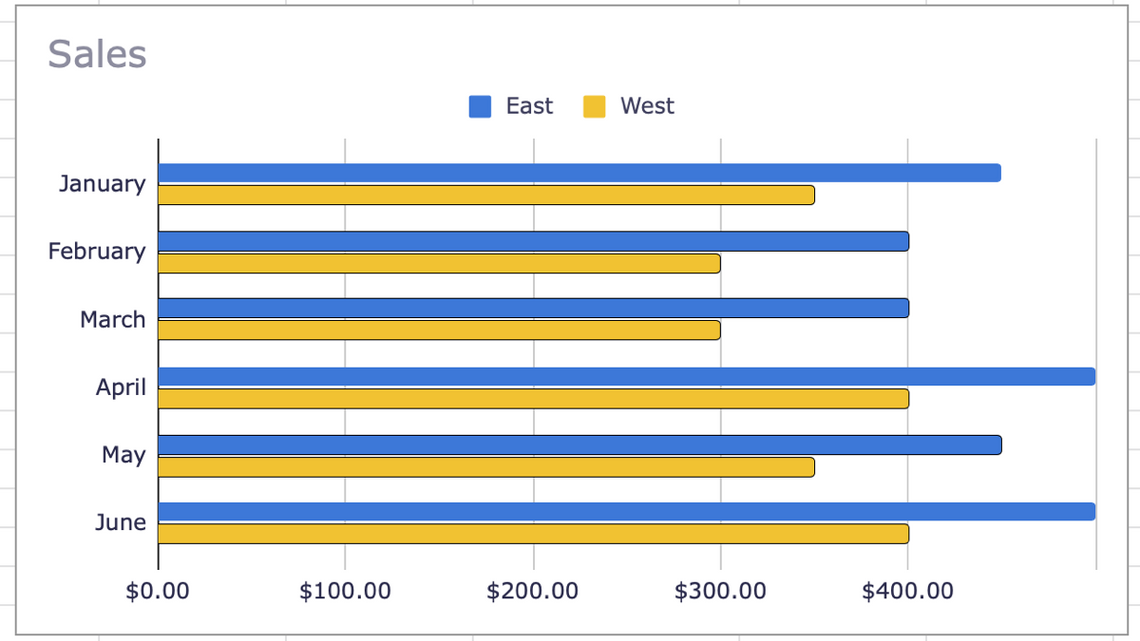
You'll see the chart update immediately to the new type, ready for you to customize if you like.
Customize a Bar Graph in Google Sheets
The graphs you create in Google Sheets offer most of the same customization options. You can change the title, add axis titles, pick a background color, and select the font style.
Open the Chart Editor sidebar by clicking the three dots on the top right of the graph and picking "Edit Chart."
Select the Customize tab at the top of the sidebar. You'll then see your customization options listed and collapsed, so you can expand whichever you want to work on.
Let's take a look at few options you may want to change specifically for the bar chart.
Modify the Series
The graph uses default colors for each of the bars, but you can change these to match your company or organization's colors.
Expand the Series section in the sidebar. Then click the Apply to All Series drop-down list and choose the series you want to change.
You can then adjust the color and opacity for both the fill and the line. You can also choose a different line type and select the thickness.
Format a Data Point
If you want to highlight a specific bar on the chart, you can format it to make it stand out. Below the line options in the Series section, click "Add" next to Format Data Point.
When the pop-up window displays, either click the point on the chart or select it from the drop-down list. Click "OK."
You'll then see a color palette display in the sidebar by the data point. Pick the color you want to use and the chart will update.
You can follow the same process to format additional data points. To change or remove the data point, select a different one from the drop-down list or click "Delete" beneath it in the sidebar.
Add Error Bars
You can also add error bars to your chart based on value, percentage, or standard deviation. At the bottom of the Series section in the sidebar, check the box next to Error Bars.
Then choose Constant, Percent, or Standard Deviation in the drop-down list and enter the value you want to use to the right.
Your chart will display these error bars on the right sides of the bars.
Creating a bar graph in Google Sheets is easy, and the customization options allow you to perfect the appearance of your chart. If you are limited on space, take a look at how to use sparklines in Google Sheets instead.