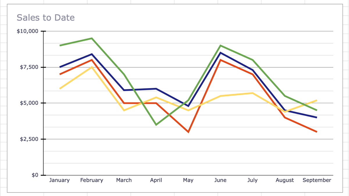
If you want to visually display data that changes over time, a line chart is ideal. With just a few clicks, you can create a line graph in Google Sheets and then customize it to your liking.
Make a Line Chart in Google Sheets
Start by selecting your data. You can do this by dragging your cursor through the range of cells you want to use.
Go to Insert in the menu and select "Chart."
Google Sheets pops a default style graph into your spreadsheet, normally a column chart. But you can change this easily.
When the graph appears, the Chart Editor sidebar should open along with it. Select the "Setup" tab at the top and click the "Chart Type" drop-down box. Move down to the Line options and pick the one you want from a standard or smooth line chart.
The graph on your sheet will update immediately to the new chart type. From there, you can customize it if you like.
Customize a Line Graph in Google Sheets
Most types of charts you create in Google Sheets have the same customization options. So you can do things like change the title, choose a background color, or give your graph a border.
If you closed the Chart Editor sidebar, reopen it by clicking the three dots on the top right of the chart and picking "Edit Chart."
In the sidebar, select the Customize tab at the top. You'll then see all of your options listed and collapsed. This lets you can expand only what you need or one at a time.
Let's take a look at a few customization options particular to line charts.
Adjust the Series
For each series on your chart, you have a colored line. Maybe you'd like to change these colors, adjust the thickness, or choose a different line type.
Expand Series in the sidebar. To change each series individually, select the drop-down for Apply to All Series and pick the one you want to adjust first.
You might change the color for that line or select a point shape. You'll see any changes you make apply to your line graph immediately.
If you want to make an adjustment that applies to all, such as changing the line thickness, select "Apply to All Series" once more and make your changes.
Change the Gridlines and Ticks
Another adjustment you may want to make to your line chart is for the gridlines and ticks. Expand that area in the sidebar to view your options.
For the horizontal axis, you can only change the major ticks. But for the vertical axis, you can adjust both major and minor gridlines and ticks. You can choose a different color for the gridlines and select a position, length, thickness, and color for the ticks.
Modify the Legend
Although you can change the legend for other types of charts in Google Sheets, it's something else you may want to modify for your line graph.
Expand "Legend" in the sidebar. You can then change the position along with the font style, size, format, and color.
If you don't want to use a legend at all, select "None" in the Position drop-down list.
Because it's so simple to make a line graph in Google Sheets, you can give your sheet some pizzazz or your viewers an easy way to see your data at a glance. If you're looking for something on a smaller scale, take a look at how to use sparklines in Google Sheets instead.

