Quick Links
If you've been perusing the menu in Google Sheets, you may have noticed a tool called a Slicer. This handy feature allows you to filter tables, charts, or pivot tables in your spreadsheet. We'll show you how to put them to use.
What Is a Slicer in Google Sheets?
As mentioned, you can use a slicer to filter data. So you may be wondering how this is different or better than the filters available in Google Sheets.
That's simple: a slicer can remain on your sheet, and, with simple buttons, you can filter the table or chart attached. This makes the tool ideal for manipulating data at a glance.
If you use a filter in Google Sheets, you cannot save it for reuse. Alternatively, you could save a filter view in Sheets and reuse it when you like.
But with a slicer, you can set a default filter. This means that everyone with access to the sheet will see the filter already applied when they open the sheet. This is perfect for a custom dashboard you set up for your team.
Add and Use a Slicer in Google Sheets
Now that you know what a slicer does, let's take a look at how to add and use one.
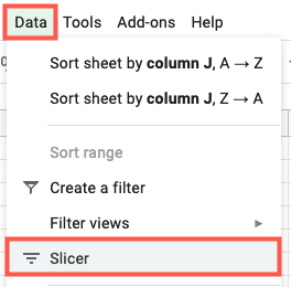
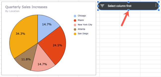
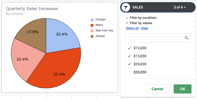
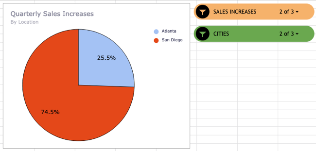
Select the chart or table where you want to apply the slicer. For our example, we'll use a pie chart so you can see how easily the data is filtered. Go to the menu and click Data > Slicer.
You'll then see the slicer which looks like a floating toolbar. You can move it wherever you like on your sheet.
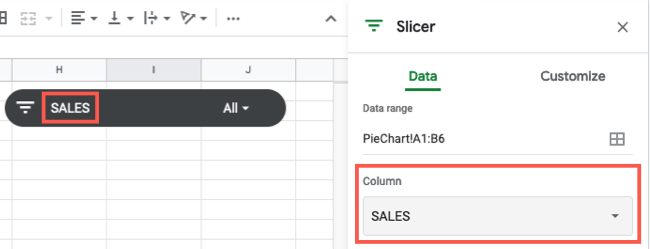
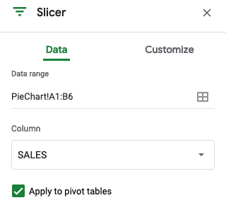
Then, select a column to filter in the sidebar that displays. If you don't see the sidebar, double-click the Slicer to open it.
You should see the column labels for the data you used in the Column drop-down list. Select one and you'll see it display on the slicer.
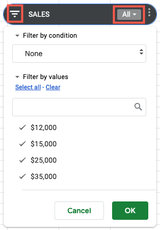
Click the filter icon or the drop-down arrow on the slicer to apply a filter to that column. You'll see that you can filter by condition, such as text that contains a keyword or values greater than a certain amount. You can also filter by value by deselecting the values you don't want, leaving those you do want marked.
Click "OK" to apply the filter and you'll see your data and chart or table update immediately. You can also see the number of items filtered on the slicer itself.
Return to these spots to change or clear the filter as needed.
Edit or Customize a Slicer
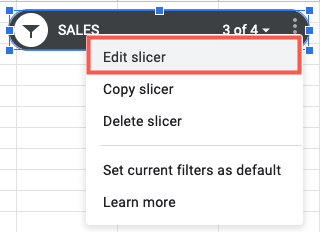
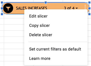
You can change the data set, filter column, or appearance of your slicer. Select the slicer, click the three dots on the top right of it, and choose "Edit Slicer."
This reopens the Slicer sidebar with tabs for Data and Customize. Use the Data tab to adjust the data range or the Column drop-down to pick a different filter column.
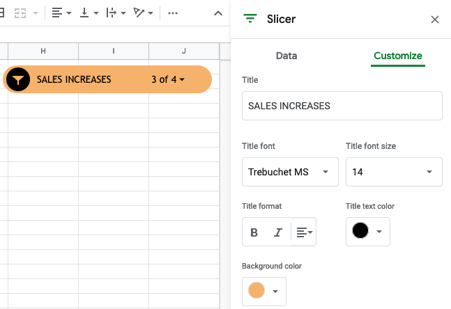
Use the Customize tab to change the title, font style, size, format, or color, or alter the background color.
More Slicer Actions
When you select the slicer and click the three dots, you'll see more actions. You can copy or delete the slicer as well as set the current filter as the default.
Additionally, you can add more than one slicer to the same data set. This lets you set up multiple filters for various columns of data for your chart or table.
For a quick and convenient way to filter your table or chart data, and keep the filter visible, check out the slicer tool in Google Sheets.
If you also use Excel, take a look at how to sort and filter data there as well!

