The majority of internet usage now happens on phones and tablets, so you may want to check how a website looks on mobile. Google Chrome has a handy tool that lets you do that right from your desktop computer.
Maybe you're doing web development and you want to test how responsive your website is, or maybe you're just curious. Either way, you can quickly check from Chrome's "Inspect" menu. We'll show you how it works.
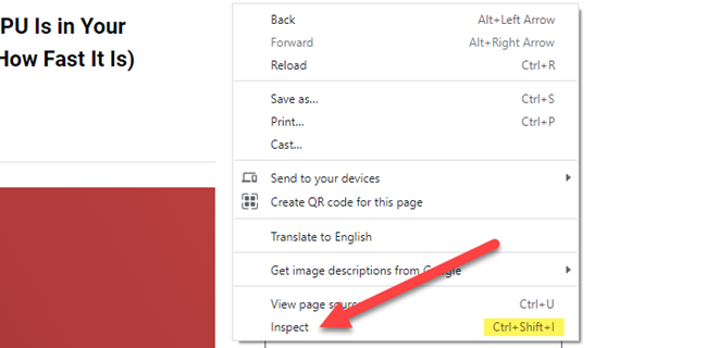
First, navigate to the website that you want to see in mobile view from Chrome on the desktop. Once there, you can do one of two things:
- Right-click on blank space and select "Inspect" from the menu.
- Use the keyboard shortcut Ctrl + Shift + I (That's a capital "i.").
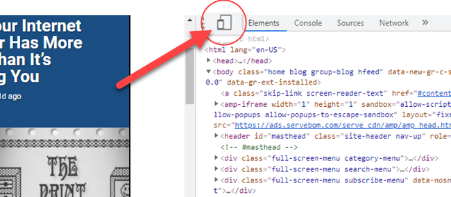
The Inspect menu will open from the right side of the browser window. All you need to do is click the device icon in the top toolbar.
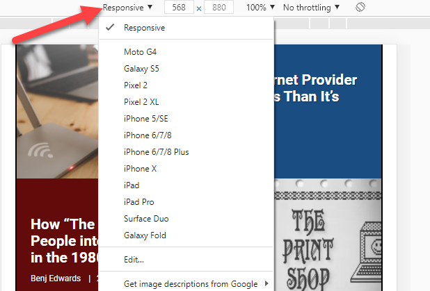
The page will immediately switch to a mobile layout. By default, it will be in "Responsive" mode, and you can drag the handle on the right side to see the page dynamically change as the screen gets wider.
You can also select the drop-down in the top bar and see the page formatted for specific devices.
Close the "Inspect" menu or click the device icon again to switch back to the desktop layout.
That's pretty much all there is to it. Now, you can easily view websites in a variety of different mobile layouts in Chrome without bothering to pick up your phone.


