Quick Links
Color is one of the most important elements of photography, but also one of the most awkward to learn how to use in your photos. Unlike controlling your camera, it's not a mechanical skill that you can master with a bit of practice. Color takes theory to understand---so let's get started.
Why Color Matters
Humans can distinguish around a million different colors, and they're a huge part of how we see the world. Subtle changes in the color of someone's face are part of what lets us know if they're happy, embarrassed, or angry, for example.
But colors aren't just a functional thing. Human society places huge emotional meaning on different colors. There's an entire field of psychology devoted to studying how things like the color of the room we're in can affect our moods and attitudes. Warmer photos seem more inviting, while colder, bluer images have a different, more standoffish vibe.
And of course, interesting colors just look good. The whys are probably deep in our genetic code, but there really is something special about the deep orange of a sunset, and some colors just look better together than others. A photo that's a mishmash of clashing colors just isn't as pleasing to the eye as something with complementary blues and golds.
If all of this sounds a bit wishy-washy, well, it is. A lot of how color is perceived is down to cultural preconceptions and context. Red can be both relaxing and warning, a symbol of love or of anger. Still, it's important to understand that the colors in your images matter---and that you can control them to get better photos.
The Components of Colors
There are a few different color models, but the one that's most useful to photography is called HSL. It's different from the Primary/Secondary/Tertiary color model that you probably learned about in school.
In HSL, every color has three key components: its Hue (or color), its Saturation (or how intense the color is), and its Luminance (or how bright the color is).
Hue
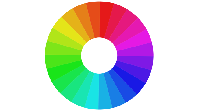
Hue is pretty intuitive: It's the base color. Hue is normally described using a color wheel that goes from red (0º) through yellow (60º), green (120º), cyan (180º), blue (240º), magenta (300º), and back to red (360º).
Saturation
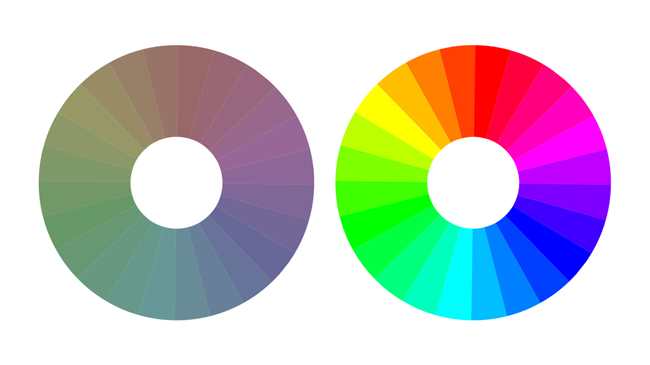
Saturation is about how intense a color is. More intense colors are more saturated, while less intense colors are less saturated. In Photoshop and most image editing programs, color saturation is normally expressed as a percentage.
Luminance (or Brightness)
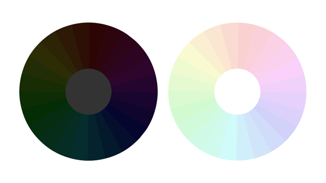
Luminance or Brightness is how bright or dark a color is. For example, reds can be a bright almost-pink or a dark maroon depending on the luminance.
Using HSL
Although far from a perfect model of color for everything, HSL is great for photographers, as it gives us a way of considering colors individually or together. Many common color schemes are based around the hue color wheel:
- Analogous colors are ones that sit next to each other, like red and orange, blue and cyan, or blue and green.
- Complementary colors are ones that sit directly opposite each other, like yellow and blue and red and cyan.
And then there are more advanced color schemes, like triadic, quadratic, and split complementary, which we'll leave for another article.
Using Colors in Your Images
Now that you have a grasp of the basics of color theory, let's look at it in practice.
Monochrome Images
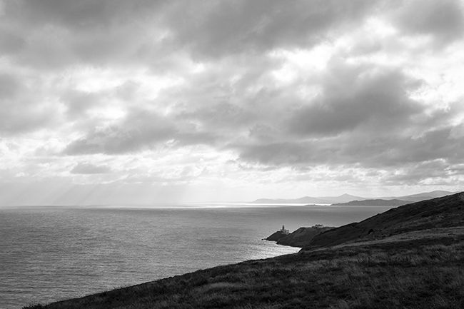
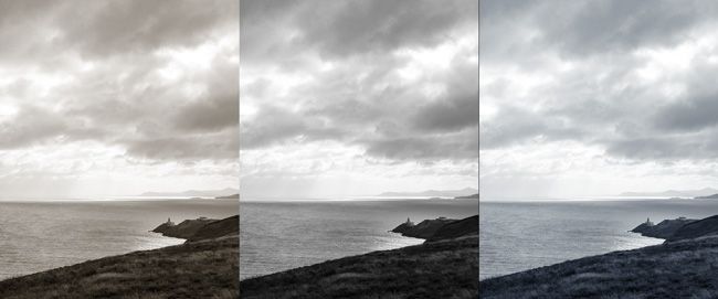
Monochrome images are ones made up of a single hue, with variations in saturation and brightness. Black-and-white images are the classic "monochrome" photos, but you can have monochrome images of any color.
Also, even black-and-white images can have a touch of color to them. Depending on the development process, film prints could be slightly warm (sepia) or slightly cold (cyanotype).
Emulating these processes in Photoshop is a great way to subtly alter the mood of your images.
Tonal Images
Tonal images use analogous colors, which are colors that sit next to each other on the color wheel.
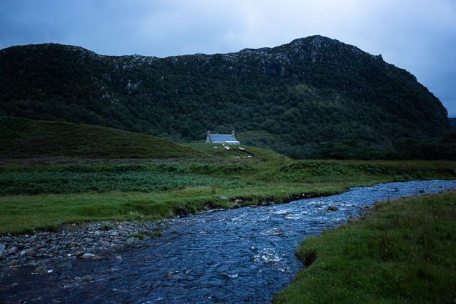
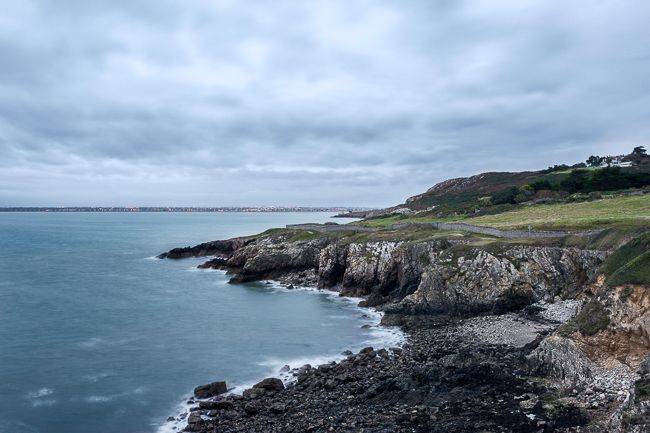
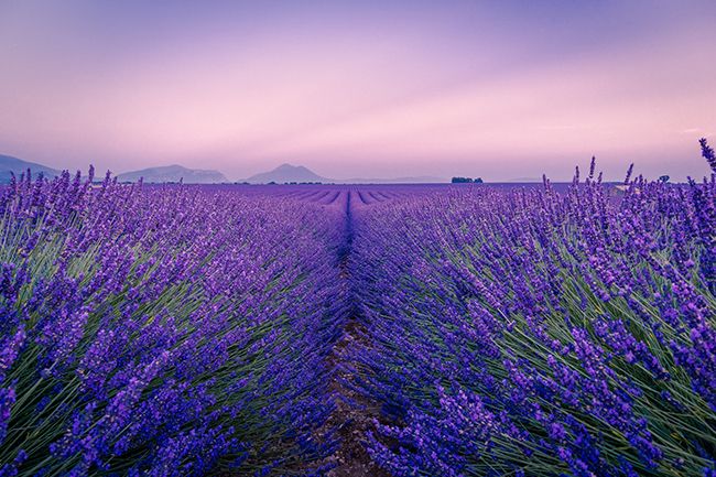
Green and blue, with perhaps a bit of yellow, is a very common one---especially with landscape images. The colors often appear together in nature, so they're easy to work with.
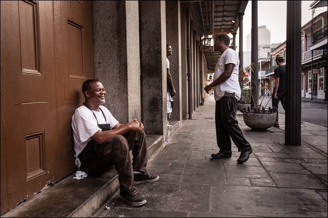
But with that being said, tonal images aren't limited to nature. Look around and you can find opportunities in simple street scenes. The photo above uses browns---or really, oranges and yellows.
Complementary Images
Complementary colors make for some of the best images.
The classic example is an orange sunset over a dark blue sea, but look at the color wheel and you'll see that you have a dozen or so possible pairings. Just check out how the greens work with the magentas in this shot---it's stunning.
Putting Color Theory into Practice
Once you understand how color can work in your images, the next part is putting it into practice in the real world.
Unfortunately, it can take a lot of work to find situations with great color palettes. Most potential scenes just aren't composed of perfectly complementary colors. They're an eclectic mess of anything and everything.
There are, however, a few tricks that you can use to increase your chances of finding them:
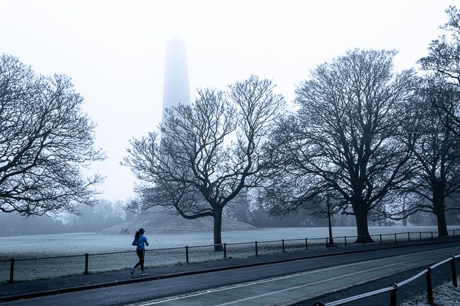
The weather is your friend. Gray days, mist, heavy rain, snow, and other kinds of weather can all desaturate a scene and tie everything together.
Sunrise, sunset, and the hours around them are great times to take photos. The blues, reds, and oranges that you get from the sun (depending on the exact time) are easy to work with.
Keep an eye out and carry a telephoto lens. Even in a busy scene, there can be elements that have analogous or complementary colors you can photograph.
And even when you find a great color photo opportunity, capturing it in-camera is only half the work. Great images always take some kind of post-production, especially if you want to emphasize the colors.
Some of the things that you can do are:
- Remove---or desaturate---elements with really distracting or clashing colors.
- Use gradient layers and other tools to "color grade" the image so that the colors are closer together.
- And in many cases, you can convert the photo to black and white---although that brings with it a different set of considerations.
But like everything in photography, there's no alternative to grabbing your camera, heading out the door, and shooting lots of pictures with intention. You now have enough of an understanding of the basics of color theory to look for opportunities to use it. The best way to learn more is by doing.


