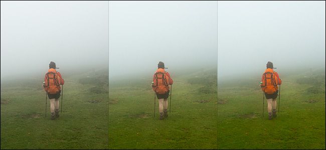
Adobe Photoshop Lightroom is incredibly powerful. Its global sliders are a convenient way to make complex adjustments to your images. For example, Clarity and Texture do similar things in different ways, while Saturation and Vibrance do the same thing to differing degrees.
Saturation 101
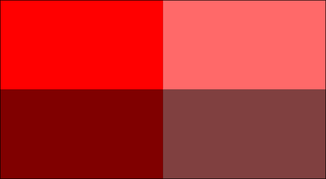
Every color has a saturation value, which is a measure of how intense it is. Redder reds are said to be more saturated than less red reds. Both the Saturation slider and Vibrance slider adjust the saturation of the colors in your images---they just do it slightly differently.
What Does Saturation Do?
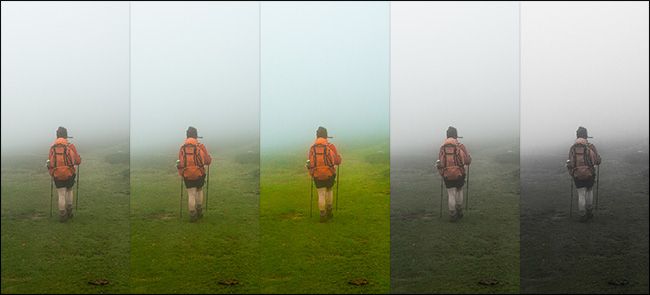
The Saturation slider adjusts the saturation of every color in your image in the exact same way. Drag the slider to the right to increase the overall saturation of your image, and drag it to the left to reduce it.
The Saturation slider, however, is a very blunt tool. If some parts of your image are already pretty saturated, it can push them too far.
What Does Vibrance Do?
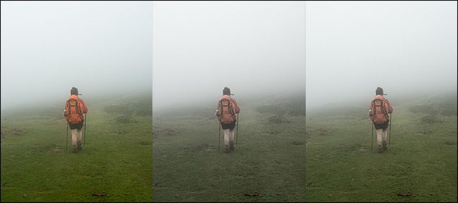
The Vibrance slider is a more nuanced version of the Saturation slider. It adjusts the saturation of the colors in your image, but it has more of an effect on the least saturated colors. The colors that are already highly saturated will barely change as you increase the vibrance.
Which Should You Use?
Both the Saturation and Vibrance sliders have a place in a photo editing workflow.
Saturation is best used carefully to add punch to your whole image. If, for example, you take some photos on a gray, cloudy day, the entire photo might need a lift.
Vibrance is a little safer to use, and I often add quite a bit to my photos. It's great for enhancing the colors in your image without making them look garish or unrealistic.
Saturation and Vibrance can---and should---be used together. One common way is to use the Saturation slider to reduce the saturation in your image and then use the Vibrance slider to add color back to the areas that have gone a bit too gray.
You can also use them with Lightroom's local adjustment tools to target specific areas of your image. It's handy if you want to reduce the saturation of something distracting in the background.
As with any aspect of photo editing, the best way to understand the different tools is to use them on some of your photos. Play around with different kinds of images and see how both Saturation and Vibrance affect the colors.


