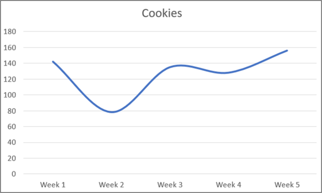
When you create a line graph in Excel, the lines are angled and have hard edges by default. You can easily change this to a curved graph with nice, smooth lines for a more polished look. We'll walk you through the process step by step to convert your graph.
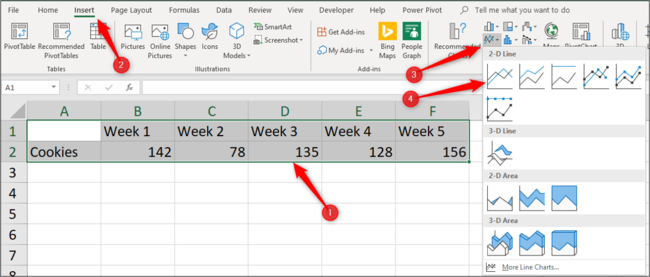
In this example, we want to create a curved line graph from this data on cookie sales.
Select and highlight the range A1:F2 and then click Insert > Line or Area Chart > Line.
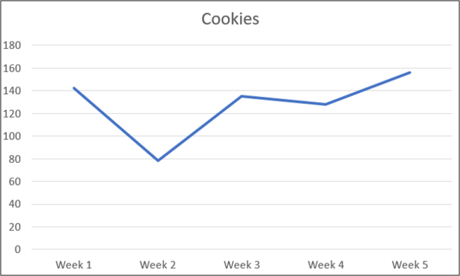
The line graph is inserted with straight lines corresponding to each data point.
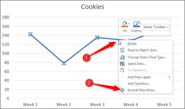
To edit this to a curved line, right-click the data series and then select the "Format Data Series" button from the pop-up menu.
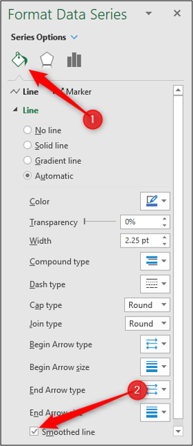
Click the "Fill & Line" category and then check the box for "Smoothed Line."
Using a smoothed line can help make your line graphs look smarter and more professional.
Smoothed lines can also be a clever way of distinguishing one data series from another. For example, targets from actuals or last year to this year.


