Creating charts in Excel spreadsheets is a great way to represent data in a visually appealing way, but can be too time consuming finding the appropriate one. Today we take a look at Chart Advisor from Microsoft Office Labs which makes the process more efficient.
Note: Remember this is a prototype and under development and may not work perfectly with your system.
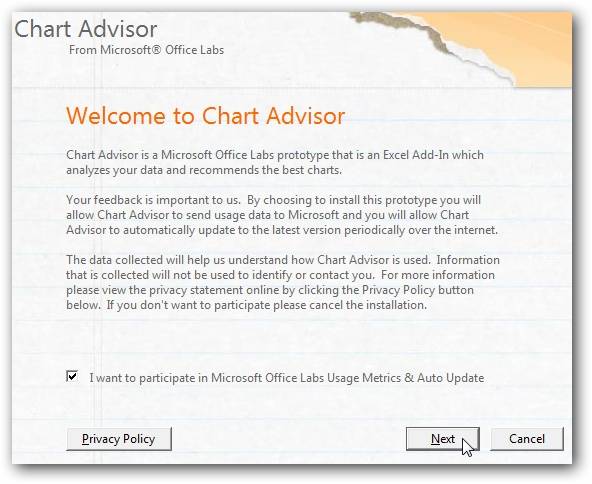
Install Chart Advisor
Because this is an Office Labs prototype you will need to participate in Usage Metrics and Auto Update. Continue through the installation wizard to complete the process.
After the installation is complete open Excel and you will see it under the Insert tab in the ribbon.

Using Chart Advisor
Here we will take a look at using Chart Advisor. Open up an Excel spreadsheet and select the data you want to to create a chart on. In this example we’re using monthly sales figures for tools and supplies. After you have highlighted the cells click on Chart Advisor under the Insert tab.

Give it an moment while Chart Advisor analyzes the data and recommends appropriate charts.

Hover over the different suggestions at the top to get a more detailed view of how it will look.

The amount of charts you have to choose from will be determined by the data cells you select. Also notice they are sorted by relevance.

Just hover the pointer over the percentage box on each suggestion to get a detailed formula of why it got its score.

You can filter data to further modify the charts.

You can further tweak the chart under Modify Chart and change data positions, exclude data, etc.

When done configuring the chart just click the Insert Chart button to place it into the spreadsheet.

If you are looking for a way to speed up how you create charts and graphs in your Excel presentations then you might want to check out this add-on.