Programs like Photoshop have allowed new generations of would-be designers jump in and create with greater ease than ever before. See just how easy it is by learning the Type Character Panel, and applying it to some basic design work.
Having covered the text tool briefly in Part 1, The Toolbox, and creation of text objects in Part 3, Layers, let's take a closer look at how to set typography in Photoshop. Of course, if you've missed any part of the How-To Geek Guide to Learning Photoshop, each are still available in this bundled link.
Fonts and the Character Panel
While vector programs like Adobe Illustrator are superior choices for handling abstract shapes like fonts, Photoshop is no slouch in the Typography department. It is capable of nearly any typographic treatment Illustrator is capable of, and some that it isn't.

The character panel can be found by going to Window > Character, if it is not already in your right side panel. It is rich with options for your text, which we'll go over now. Be warned, that this section contains complicated typographic terms that you may or may not know. Brush up on your typography terms with the How-To Geek article, "Understand Typography Like a Professional Designer," or simply keep reading.
Font Family: Where you chose the font your text object is set in, for example, Helvetica, Arial, Times New Roman, etc.
Font Style: If you have font families installed, your "font style" may be active, this is where you can choose alternate versions of the same face. For instance, Arial Bold, Arial Narrow, Arial Condensed, Arial Rounded MT, Arial Black, etc.
Font Size: Where you can numerically alter the size of your font. Type in numbers here or use the pulldown menu for suggested common point sizes.
Leading: Typographic term for the space between lines of paragraph text, set in points.
Kerning: Horizontal spacing between pairs of letters. Negative numerical values here will close spaces between characters while positive values will add space between letters.
Tracking: Similar to the concept of Kerning, Tracking adjusts the general kerning over an entire text object or over several selected letters. You can adjust tracking on a text object, and then kern between individual letters, if you wish.
Vertical Scale: A controlled way to stretch and squash typography up and down. Input numerical values here in percent of the original character height.
Horizontal Scale: A controlled way to stretch and squash typography to the left and right. Input numerical values here in percent of the original character width.
Baseline Shift: The baseline is the line the text "rests" on. Move certain selected characters off the baseline to make them appear higher or lower than the rest of the set text.
Text Color: An area where text object color can be adjusted.
Language: Adjusts the language the text is set in, in case non-English characters are needed.
Anti-Aliasing: Options for rendering text in pixels by adjusting the amount of pixel blurring used to describe the edges of type. "None" renders letters in hard-edged pixels, while all others use various forms of anti-aliasing.
Faux Bold and Other Character Panel Options

|
Faux Bold: The size of your current font is artificially thickened to create an artificial bold font. Using an actual bold font in the "Font Family" or "Font Style" is generally preferable. |

|
Faux Italic: Your current font is artificially slanted to the right, creating a false italic look. Again, using an actual italic font in the "Font Family" or "Font Style" is preferable. |

|
Uppercase: Transforms your type into all uppercase. Very useful in those cases where it is time consuming to retype large sections of upper and lower case text. |

|
Small Caps: Creates a false small caps by shrinking the point size of your uppercase letters. All lowercase letters will be replaced with these smaller capitals in your text object. |

|
Superscript: Changes selected text or text object to superscript, as in the case of 28. |

|
Subscript: Changes selected text or text object to subscript, as in the case of C6H12O6. |

|
Underline: Adds a simple underscore underneath your selected text or text object. |

|
Strikethrough: Adds a simple strike through all of your selected text or text object. |
The Options Panel and the Type Tool

Some options not available in the Character Panel are waiting at the top of your screen, in the Options Panel, when you use the Type tool. These three are:

|
Text Orientation: Toggles the direction the text in your text object runs, either horizontally or vertically. |

|
Alignment: Sets the alignment of your text object either to Left-Aligned, Center-Aligned, or Right Aligned. |

|
Warp Text: Warps text objects into one of several pre-defined, adjustable shapes, like banners or other objects. |
Designing a Simple Book Cover

Because design is about real world application, we will look through the creation of a basic book cover design for one of the most important (not to say controversial) scientific books of all time, On The Origin of Species By Means of Natural Selection, by Charles Darwin.


brings up the levels tool to adjust the image of Darwin. While design is not necessarily simply about arrangement of elements, this simplistic approach will suffice for demonstration purposes.

As the image is blacked, Ctrl click on the Gray channel in your channels panel. This creates a selection of all the white in the image.
Edit: If your file is not already in Grayscale, but RGB or CMYK, you should go to Image > Mode > Grayscale before Ctrl + Clicking on your grayscale channel. Thanks to HTG reader l3utterfish for bringing this to my attention.

Press

to create new layer.

Edit > Fill to fill the selection in your new layer with white.

The icon photograph of Darwin is now removed from the black background and ready to be used as an element.

Press


to create a new document at your preferred size. The size illustrated is the same size of another important book, Robert Bringhurst's The Elements of Typographic Style.

And here is our very tall workspace for the book cover.

Pick a foreground color in the

in your toolbox. Any color will suffice, although in this demonstration, a dark color is preferable.

Edit > Fill and be certain to set "Use" to "Foreground Color."

The background is filled with the wine color chosen earlier.

Press shortcut key

. Navigate to your original file, and drag your layer into your new file using the selected Move Tool.

The layer should appear something like this inside the new file.

Press

or select the type tool, Illustrated above to start setting type.

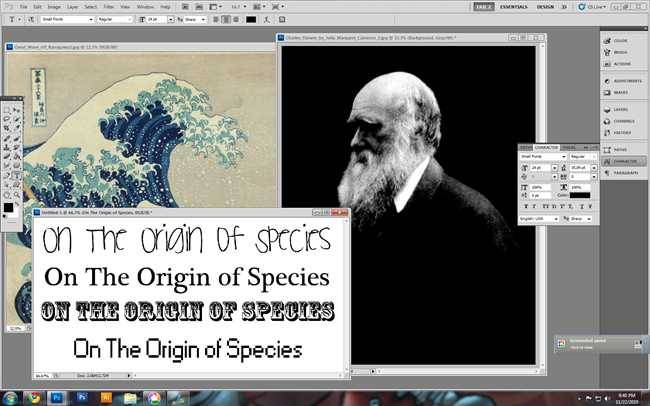
Not all fonts are appropriate to the content. This pixelated font is very bad for this concept.

A more conservative font may honor the content and create a more appropriate look.

With even a few limited font options installed, it can seem overwhelming. However, picking the right font is difficult and time consuming, but altogether very important to a piece of design.

When the right font is found, adjusting it with the Character Panel is a simple matter.

The font size is changed,and the type broken into two lines.


When the point size is adjusted, we may run into issues with leading.

When letters collide, readers will be left with legibility and readability issues. Adjusting leading is the only response.

Increasing the point size of the leading improves the readability of the title.

Additional information will have to be added, and oftentimes, Photoshop assumes you want to use the same font as point size as your last used text object. This may or may not be the case.

New text objects added and adjusted, we can start to access our design as a whole.

We may find we wish to move elements around.

We may also add more elements or subtlety shift text, to keep a consistent line on the page. The Text tool will also allow you to adjust typos, like the letters "Means" "Natural" and "Selection" that need capitalizing in a title.

Additional elements can also help a design, like this skeleton of Lucy, the famous Australopithecus afarensis. Again, design is not necessarily a simple combination of elements, as it can involve process Photoshop is completely incapable of. However, it is often an excellent tool for this sort of graphics work.
Photoshop tips left you confused? Start at the Beginning! Check out the previous installments of the How-To Geek Guide to Learning Photoshop.
- Part 1: The Toolbox
- Part 2: Basic Panels
- Part 3: Introduction to Layers
- Part 4: Basic Menus
- Part 5: Beginner Photo Editing
- Part 6: Digital Art
- Part 7: Design and Typography
- Part 8: Filters
Come back to How-To Geek for the Final installments of the Guide to Learning Photoshop, where we'll wrap up our guide with a look at the Filters of Photoshop.
Image Credit: Darwin by Julia Margaret Cameron, in public domain. Lucy by Wikipedia user 120, made available under Creative Commons.