Quick Links
Color is one of the most important aspects of photography. It can make or break your images. It's great when nature gives you great color to work with, but you also need to deliberately manipulate colors in your photos, both while you’re shooting and in post-processing.
One of the best ways to start experimenting with colors in your image is to use a limited color palette. In other words, to try and take images where there are only one or two dominant colors. When you’ve loads of different colors things look chaotic, like in this image.

Whereas when you’ve got a photo with just a few colors that work well together, in this case browns and greys, they look a lot better.

Let's talk a bit about how to work with a limited palette.
The Simplest Limited Color Palette: Black and White
When people start deliberately trying to take good photos, one of the first things they do is convert absolutely everything to black and white. Why? Because as long as the photo is well composed and technically okay, it will normally look good in black and white. By reducing everything to greyscale, you remove any distracting colors and pull everything together.
Let’s look go back to that chaotic photo from earlier. It’s well composed, and there’s nothing technically wrong with it. The issue is that the colors are all over the place. There are greens, reds, yellows, and browns all competing for your attention. The focal point of the image should be the guy in the bar window, but your eyes are drawn everywhere.
Now let’s convert it to black and white and… boom! It looks a lot better. Rather than a chaotic mess of colors, it’s an interesting street scene.

Converting images to black and white is all well and good, but it has one major problem: color is a really important part of photography. No one wants to look at a sunset in black and white.
Exploring Limited Color Palettes in the Real World
To start exploring limited color palettes, you need to do two things: play around with limited colors in the real world, and post-process your images. Let’s start with looking at limited colors in the real world.
Here’s the before and after of an image with a model named Ali. She’s wearing a purple top and yellow jacket and she’s sitting in a field of yellow grass with some purple flowers. The straight-out-of-camera image already has a limited color palette, and I’ve just amplified it in the edit.

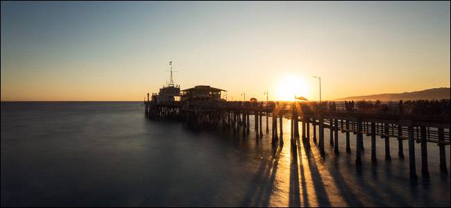
This is a landscape example that I shot in Santa Monica at sunset. Blue and gold are two of my favorite colors to use together. It’s very easy to do if you take photos by the sea at sunrise or sunset.

I love that shot, but lets look at the straight out of camera image.

The gold is a little less pronounced, but the original colors are for the most part still the ones I used in the final image.
The trick to playing around with limited color palettes in the real world is to start consciously looking at colors. The day I took the photo of Ali, she just happened to be wearing yellow and purple, so when we found a field with those colors too, we took a photo. The image below was much the same. Louie was wearing blue, so when we found a blue wall, it was a perfect backdrop.

You can also start shooting during the hour or two around sunrise and sunset. These times of the day automatically limit the colors you have to work with. At sunrise and sunset you’re going to see blues, purples, golds, oranges, and yellows. If you can create an image with two of the colors, great, but if there’s only one, that works too. Just check out this sunset shot below that’s almost entirely orange. These were just the colors I had to work with.

Night is also a great time to explore a limited color palette. The starry sky generally looks pretty blue, like in this image below.

There’s almost no way to get the chaotic mishmash of colors that you find in the first image.
Post-Processing for Limited Color Palettes
While it’s not impossible to limit the color palette of any image in post, things will always look better if you’re using it to improve an already limited color palette. I’m going to demo the effect using Photoshop, but you can do similar things in every good image editor.
Let’s use this image.

It’s nice, but I want to amplify the blues and yellows. If you’re following along with your own image, open it in Photoshop and pick the colors you want to amplify.
The first step is to increase the saturation. To do that, go to Layer > New Adjustment Layer > Hue/Saturation.

Drag the Saturation slider as far to the right as it will go without the image looking bad. For me, it’s about +34 in this image.

If you want, you can go in and edit the Saturation of each color individually or play around with the Hues, but to me, things look good.

Next, I’m going to use a Gradient Map layer to limit the colors even more. Go to Layer > New Adjustment Layer > Gradient Map and click on the gradient.

Double-click on the small square on the bottom left of the gradient, then select the color you want for the shadows and click OK. For this image, I’m going with a deep blue.

Next, double-click on the small square to the right of the gradient, select the color you want for the highlights and click OK. I’ve gone with a gold/orange.

If you want to adjust the balance of where the shadow color transitions to the highlight color, drag the little diamond in the center to the left or right.

When you’re happy with how the gradient looks, click OK. Here’s where we’re at now.

While this looks kind of cool, the effect is totally over the top. The final step is to reduce the Opacity and change the Blend Mode of the Gradient Map layer.
In the Layers panel with the Gradient Map selected, click on the dropdown where it says "Normal", and change it to "Color".

Finally, enter in a value somewhere between 10% and 50% for the Opacity.

I think around 30% looks best for this image.

And that’s it, we’re done. Here’s a before and after. As you can see, I haven’t really changed the colors, just made them more dominant and interesting.

How to Know Which Colors to Use
One of the biggest things you need to develop when working with colors in photography is a sense of which colors will work, and which will won’t. That comes with time, but here’s a quick guide.
Any Single color
A single color almost always works as a color palette, and it doesn’t matter at all what color it is. Black and white images are the most obvious example, but I’ve seen images where the whole thing is shades of orange, brown, green, pink, yellow, and pretty much every other color imaginable work. If you really want to keep things simple, just work in monochrome.
Certain Pairs of colors
Some pairs of colors work really well together, especially complementary colors. Here are some of the main ones that you’ll see used in photography:
- Blue and gold
- Blue and orange
- Teal and orange
- Green and magenta
- Yellow and purple
If you see an opportunity to use any of these combinations—say, because your model is wearing orange and there’s a blue wall—take it.
Color work is one of the things that separates good technical photographers from great artistic ones. It’s one of the most important tools in making people feel an emotional connection to your images. While there’s a huge amount more to working with colors, the best way to get started is just to limit the color palettes of your images.