Quick Links
Smartphones have been around for almost a decade, but even now, when I’m browsing the web on my iPhone, I run into websites that don’t work very well. Sometimes the problems are with the technologies used in the websites, but sometimes they lie with the apps I have installed on my phone. So with this in mind, let’s look at some of the reasons websites might not work properly on your mobile device.
Some Sites Use Outdated Technologies
For years, Adobe’s Flash was used by web developers who wanted their websites to do more than just display text and images. It was used to embed videos, add animations, and make sites more interactive. Unfortunately, Flash kind of sucks. It’s always been a mess of security holes and, even when it wasn’t sending your personal information to hackers, it hogged a lot of system resources.
When the iPhone shipped in 2007, it famously did so without support for Flash—and that was the beginning of the end for Flash. Now, it is easier than ever to get by without Flash. Safari on macOS tries to pretend it doesn’t exist, and neither iOS or the latest versions of Android ship with it.


For the most part, this doesn’t matter. Almost all modern websites have moved on to other, better technologies. But if you’re trying to access an older website, you might run into problems if it relies on Flash.
If you do encounter a Flash website on your phone, there’s not a lot you can do. If it’s really important you visit the site, try again when you’re at your computer. Otherwise, just ignore the site and move on; it’s caught in the past anyway.
Not All Sites Use Responsive Design
With the rise of smartphones, designers have had to start thinking outside the box when it comes to websites. There’s no guarantee that anyone looking at your site has a 13” screen (at a minimum), a mouse and a keyboard anymore.
Like with Flash, most modern website have changed with the times and adopted responsive design ideas—basically, the website adapts itself responsively to the device that’s viewing it. Below, you can see two screenshots: one is the mobile version of this website, and the other is what happens when I force my iPhone to display the desktop version.


Although the desktop version of most sites isn’t entirely unusable on a mobile, it can be an unpleasant experience: you need to zoom in to read text, some elements like images might not display properly, popups might be difficult to get rid of, and dozens of other small issues can drive you insane.
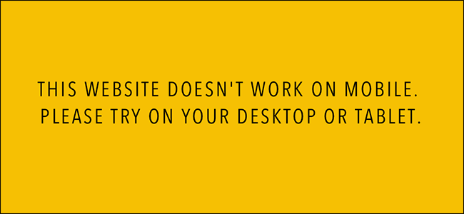
If you’re viewing a website on your smartphone and everything looks small and funny, odds are it’s because the designers didn’t use responsive techniques. Like with Flash websites, the best options are to try again on a computer or just confine the site to your mental “never visiting again” list.
Mobile Sites Might Be Missing Features
Responsive design works great and is—relatively—easy to implement for simple sites; you just have to make sure things resize dynamically for smaller screens. Problems, however, can occur with more complex sites and web apps. Sometimes, even if a site has a mobile version, that mobile version won't have all the features of the full site. Simple things are normally still possible, but digging deeper into settings menus or more complex options won't work.
If this is the case, you've got two options: visit the site from a computer, or make the site think you're visiting from a computer so you can get the full desktop version. The first solution is pretty self-evident, so let's look at how to do the second.
On iOS, hold down the refresh button. After a moment, a menu will appear at the bottom of the screen. Tap, Request Desktop Site. Safari will refresh the page and pretend that it's actually the macOS version of Safari.


In Chrome on Android (or Chrome on iOS, if you use it), tap Chrome's menu and check the "Request Desktop Site" box.

While tricking a site into thinking you're visiting from a computer can work, you might still have some of the other problems on this list. The design might be awkward to use with a small touch screen, and the site could still use outdated technologies like Flash.
Over-Aggressive Ad Blockers and Content Blockers Can Break Some Sites
On my iPhone, I use a content blocker to stop sites from loading too many ads and external resources, especially JavaScript. It’s one thing to let them load when you’re on a computer with a high speed internet connection, but if you’re travelling, or even just browsing the internet with your smartphone over 3G, all those extra resources can chew through your data cap and bandwidth.
99% of the time, websites load absolutely fine without the extra resources; they tend to be things like tracking cookies and comment sections. Very occasionally, however, the content blocker I use will cause some crucial function to break. I’ve had the most problems with news sites that require you to log in with Facebook or Twitter to see the rest of an article.
Since this problem lies with your smartphone, it’s simple to fix: you just need to reload the website without content blockers.
On iOS, hold down the refresh page button until the menu pops up. Tap, Reload Without Content Blockers and the page will refresh without them. Now you should be good to go.
Android doesn't have content blockers built into the operating system like iPhones do, but if you're using an ad blocking app, try turning it off whenever you see a site is having problems.
Almost ten years after the iPhone launched, the web is still not always a smartphone friendly place. When it’s Flash sites or unresponsive websites that are causing problems, there’s not a lot you can do. When it’s an over-aggressive content blocker, however, at least you can fix the problem yourself.